There were comprehensive reports filled with invaluable climate and soil data, yet their static nature prevented them from reaching a wider audience.
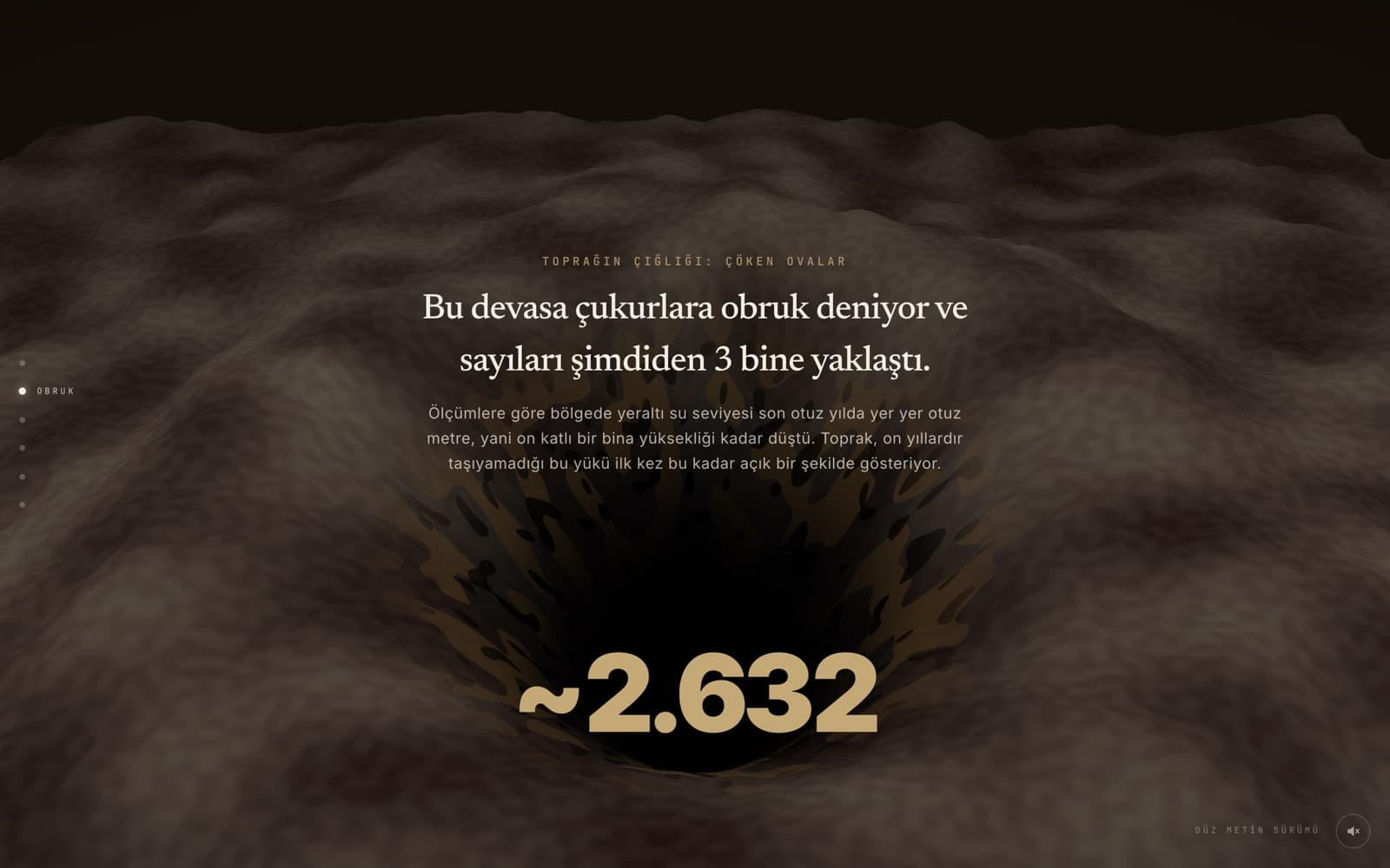
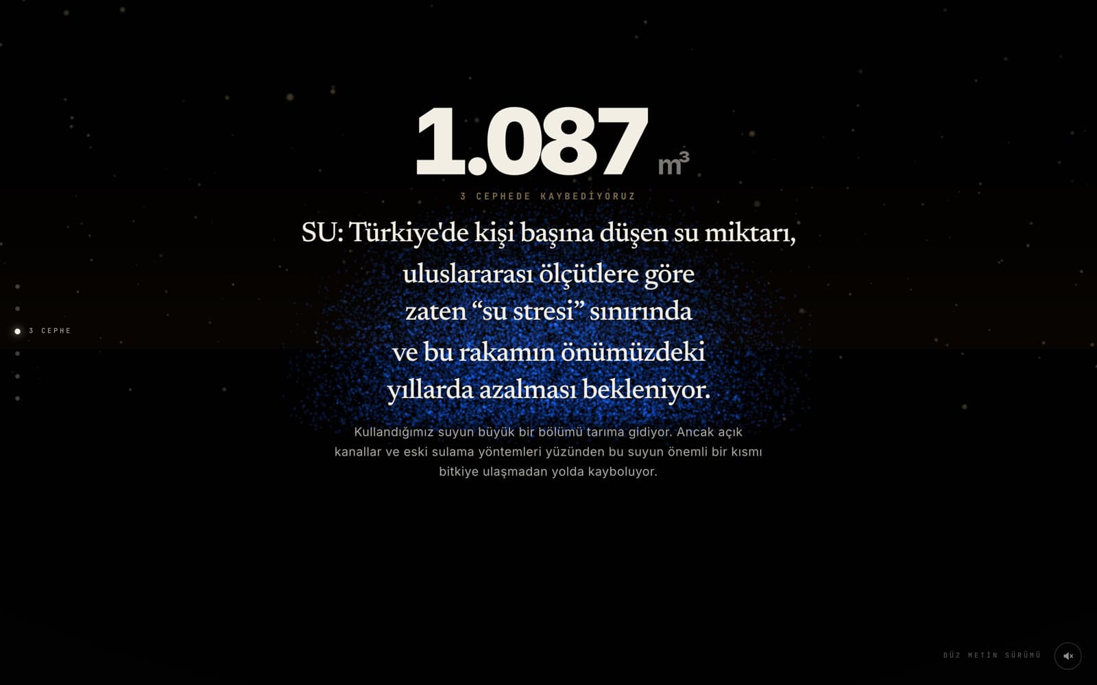
Before designing, I thoroughly analyzed the statistics, sinkhole formations, and dropping water levels. I knew it was impossible to build the right visual language without truly grasping the data.

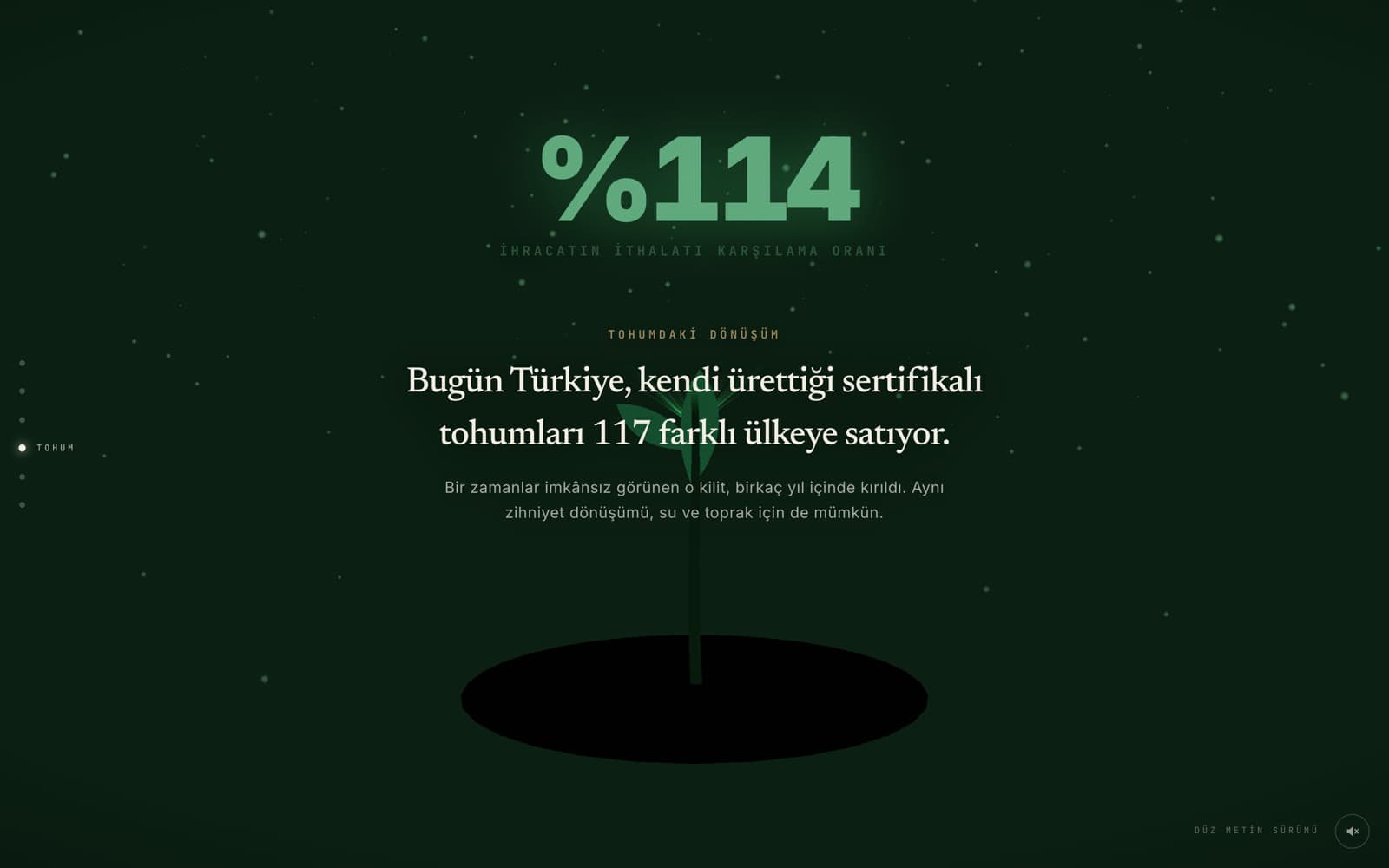
Instead of presenting static pages to read, I decided to build an interactive digital experience. I blended the information with sound, motion, and data visualization.

What used to be dense data for experts is now a digital exhibition where thousands of people willingly spend time and easily understand the narrative.
No matter how crucial the content is, it struggles to reach its goal unless presented with the right experience design. Design is the strongest bridge to make complex data accessible.